Markets
Chart: The World’s Largest 10 Economies in 2030
World’s Largest Economies in 2030
The Chart of the Week is a weekly Visual Capitalist feature on Fridays.
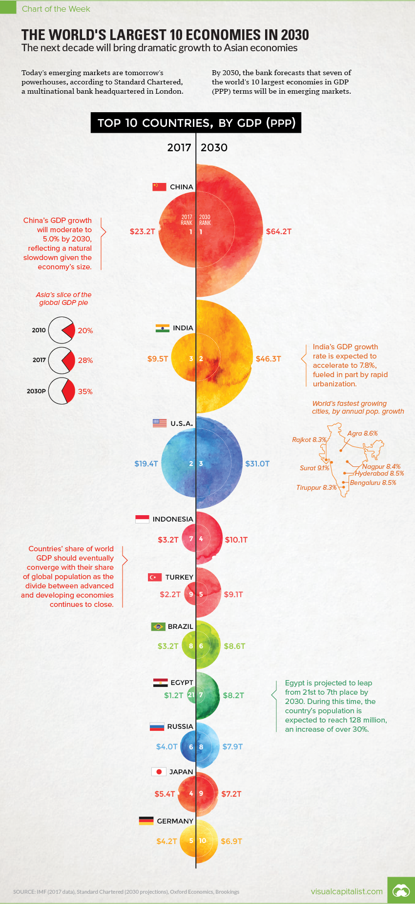
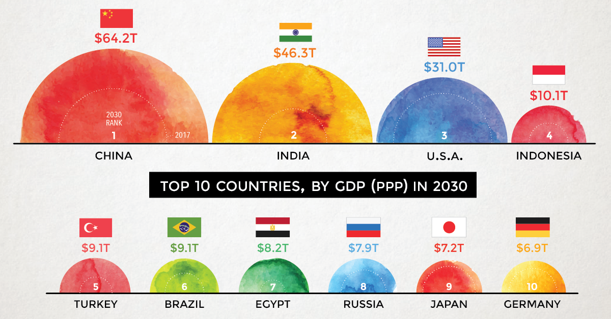
Today’s emerging markets are tomorrow’s powerhouses, according to a recent forecast from Standard Chartered, a multinational bank headquartered in London.
The bank sees developing economies like Indonesia, Turkey, Brazil, and Egypt all moving up the ladder – and by 2030, it estimates that seven of the world’s largest 10 economies by GDP (PPP) will be located in emerging markets.
Comparing 2017 vs. 2030
To create some additional context, we’ve compared these projections to the IMF’s most recent data on GDP (PPP) for 2017. We’ve also added in potential % change for each country, if comparing these two data sets directly.
Here’s how the numbers change:
| Rank | Country | Proj. GDP (2030, PPP) | GDP (2017, PPP) | % change |
|---|---|---|---|---|
| #1 | China | $64.2 trillion | $23.2 trillion | +177% |
| #2 | India | $46.3 trillion | $9.5 trillion | +387% |
| #3 | United States | $31.0 trillion | $19.4 trillion | +60% |
| #4 | Indonesia | $10.1 trillion | $3.2 trillion | +216% |
| #5 | Turkey | $9.1 trillion | $2.2 trillion | +314% |
| #6 | Brazil | $8.6 trillion | $3.2 trillion | +169% |
| #7 | Egypt | $8.2 trillion | $1.2 trillion | +583% |
| #8 | Russia | $7.9 trillion | $4.0 trillion | +98% |
| #9 | Japan | $7.2 trillion | $5.4 trillion | +33% |
| #10 | Germany | $6.9 trillion | $4.2 trillion | +64% |
Possibly the biggest surprise on the list is Egypt, a country that Standard Chartered sees growing at a torrid pace over this timeframe.
If comparing using the 2017 IMF figures, the difference between the two numbers is an astonishing 583%. This makes such a projection quite ambitious, especially considering that organizations such as the IMF see Egypt averaging closer to 8% in annual GDP growth (PPP) over the next few years.
The Ascent of Emerging Markets
Egypt aside, it’s likely that the ascent of emerging markets will continue to be a theme in future projections by other banks and international organizations.
By 2030, India will be the second largest economy in PPP terms according to many different models – and by then, it will also be the most populous country in the world as well. (It’s expected to pass China in 2026)
With the divide between emerging and developed economies closing at a seemingly faster rate than ever before, this should be seen as an interesting opportunity for all investors taking a long-term view.


Markets
U.S. Debt Interest Payments Reach $1 Trillion
U.S. debt interest payments have surged past the $1 trillion dollar mark, amid high interest rates and an ever-expanding debt burden.


U.S. Debt Interest Payments Reach $1 Trillion
This was originally posted on our Voronoi app. Download the app for free on iOS or Android and discover incredible data-driven charts from a variety of trusted sources.
The cost of paying for America’s national debt crossed the $1 trillion dollar mark in 2023, driven by high interest rates and a record $34 trillion mountain of debt.
Over the last decade, U.S. debt interest payments have more than doubled amid vast government spending during the pandemic crisis. As debt payments continue to soar, the Congressional Budget Office (CBO) reported that debt servicing costs surpassed defense spending for the first time ever this year.
This graphic shows the sharp rise in U.S. debt payments, based on data from the Federal Reserve.
A $1 Trillion Interest Bill, and Growing
Below, we show how U.S. debt interest payments have risen at a faster pace than at another time in modern history:
| Date | Interest Payments | U.S. National Debt |
|---|---|---|
| 2023 | $1.0T | $34.0T |
| 2022 | $830B | $31.4T |
| 2021 | $612B | $29.6T |
| 2020 | $518B | $27.7T |
| 2019 | $564B | $23.2T |
| 2018 | $571B | $22.0T |
| 2017 | $493B | $20.5T |
| 2016 | $460B | $20.0T |
| 2015 | $435B | $18.9T |
| 2014 | $442B | $18.1T |
| 2013 | $425B | $17.2T |
| 2012 | $417B | $16.4T |
| 2011 | $433B | $15.2T |
| 2010 | $400B | $14.0T |
| 2009 | $354B | $12.3T |
| 2008 | $380B | $10.7T |
| 2007 | $414B | $9.2T |
| 2006 | $387B | $8.7T |
| 2005 | $355B | $8.2T |
| 2004 | $318B | $7.6T |
| 2003 | $294B | $7.0T |
| 2002 | $298B | $6.4T |
| 2001 | $318B | $5.9T |
| 2000 | $353B | $5.7T |
| 1999 | $353B | $5.8T |
| 1998 | $360B | $5.6T |
| 1997 | $368B | $5.5T |
| 1996 | $362B | $5.3T |
| 1995 | $357B | $5.0T |
| 1994 | $334B | $4.8T |
| 1993 | $311B | $4.5T |
| 1992 | $306B | $4.2T |
| 1991 | $308B | $3.8T |
| 1990 | $298B | $3.4T |
| 1989 | $275B | $3.0T |
| 1988 | $254B | $2.7T |
| 1987 | $240B | $2.4T |
| 1986 | $225B | $2.2T |
| 1985 | $219B | $1.9T |
| 1984 | $205B | $1.7T |
| 1983 | $176B | $1.4T |
| 1982 | $157B | $1.2T |
| 1981 | $142B | $1.0T |
| 1980 | $113B | $930.2B |
| 1979 | $96B | $845.1B |
| 1978 | $84B | $789.2B |
| 1977 | $69B | $718.9B |
| 1976 | $61B | $653.5B |
| 1975 | $55B | $576.6B |
| 1974 | $50B | $492.7B |
| 1973 | $45B | $469.1B |
| 1972 | $39B | $448.5B |
| 1971 | $36B | $424.1B |
| 1970 | $35B | $389.2B |
| 1969 | $30B | $368.2B |
| 1968 | $25B | $358.0B |
| 1967 | $23B | $344.7B |
| 1966 | $21B | $329.3B |
Interest payments represent seasonally adjusted annual rate at the end of Q4.
At current rates, the U.S. national debt is growing by a remarkable $1 trillion about every 100 days, equal to roughly $3.6 trillion per year.
As the national debt has ballooned, debt payments even exceeded Medicaid outlays in 2023—one of the government’s largest expenditures. On average, the U.S. spent more than $2 billion per day on interest costs last year. Going further, the U.S. government is projected to spend a historic $12.4 trillion on interest payments over the next decade, averaging about $37,100 per American.
Exacerbating matters is that the U.S. is running a steep deficit, which stood at $1.1 trillion for the first six months of fiscal 2024. This has accelerated due to the 43% increase in debt servicing costs along with a $31 billion dollar increase in defense spending from a year earlier. Additionally, a $30 billion increase in funding for the Federal Deposit Insurance Corporation in light of the regional banking crisis last year was a major contributor to the deficit increase.
Overall, the CBO forecasts that roughly 75% of the federal deficit’s increase will be due to interest costs by 2034.

-

 Real Estate2 weeks ago
Visualizing America’s Shortage of Affordable Homes
-

 Technology1 week ago
Ranked: Semiconductor Companies by Industry Revenue Share
-

 Money1 week ago
Which States Have the Highest Minimum Wage in America?
-

 Real Estate1 week ago
Ranked: The Most Valuable Housing Markets in America
-

 Business2 weeks ago
Charted: Big Four Market Share by S&P 500 Audits
-

 AI2 weeks ago
The Stock Performance of U.S. Chipmakers So Far in 2024
-

 Misc2 weeks ago
Almost Every EV Stock is Down After Q1 2024
-

 Money2 weeks ago
Where Does One U.S. Tax Dollar Go?