Healthcare
Visualizing the Growth of COVID-19 in the U.S., Organized by State Peak Date
The exponential nature of viral spread means that pandemics are fast-moving and dynamic.
Combine this with the high interconnectedness of modern life—even when social distancing and lockdowns are applied—and pandemics can evolve quickly. In just a few weeks, previous hotspots can cool down, while new high risk areas can crop up seemingly out of nowhere.
In the United States, like many other places in the world, the virus is hitting regions differently, and this landscape is constantly changing over time.
COVID-19 Growth, by State
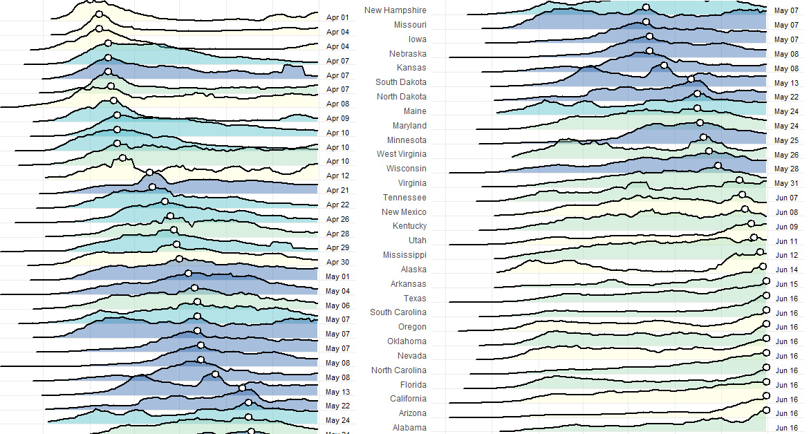
Today’s first visualization comes to us from Reddit user bgregory98, and it uses data from the New York Times to plot confirmed active COVID-19 cases by state.
States are organized by the date that weekly average cases peaked, from top to bottom. Data is normalized and is current until June 16th, and states are colored based on regional definitions (i.e. Northeast, Midwest, West, South) as defined by the U.S. Census Bureau.
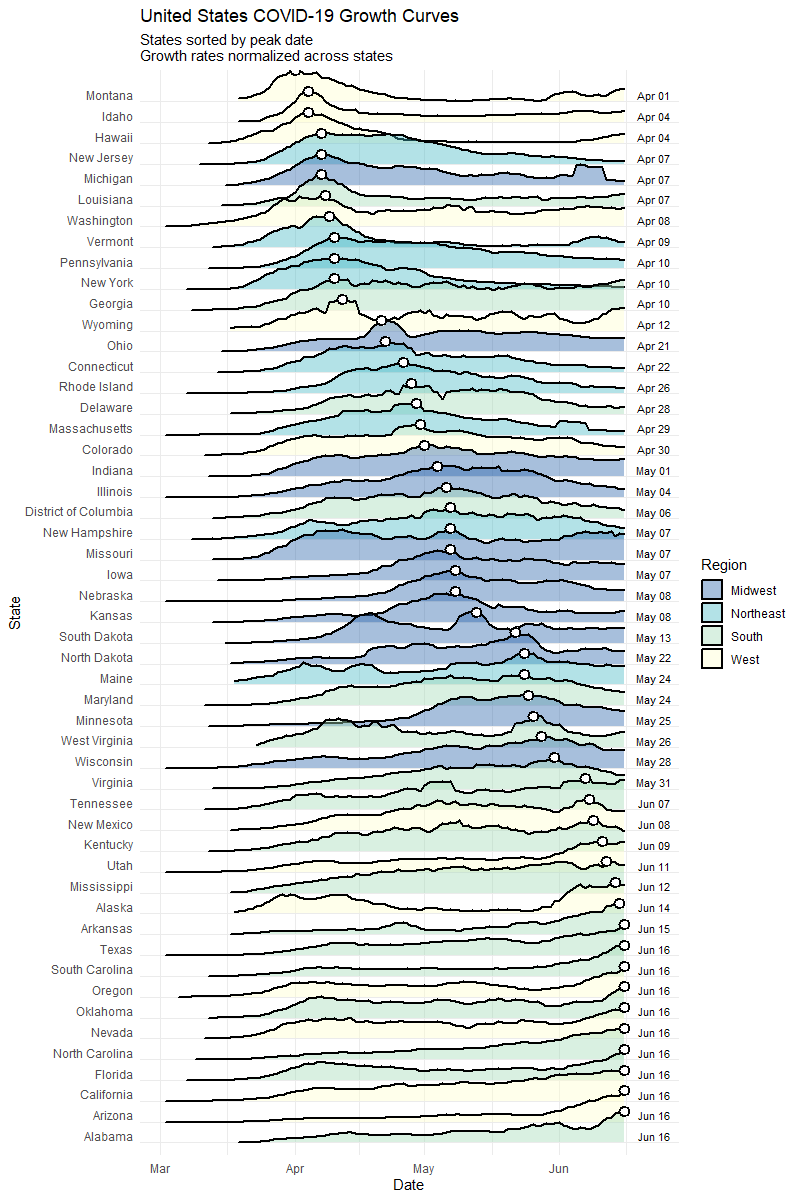
As you can see, when looking purely at active cases, the situation has evolved considerably from a geographical perspective.
Early on, COVID-19 cases were more concentrated in coastal population centers, especially in the Northeast. New York, New Jersey, and Massachusetts, the three hardest hit states per capita so far, saw cases peak in April.
However, a look at the bottom half of the visualization shows that generally, states in the South and West are starting to heat up with cases. Recent daily numbers confirm this, with California, Texas, Florida, Arizona, and North Carolina all gaining more than 1,000 new cases on June 17th.
Growth by State, Part Deux
The following visualization by Reddit user jawsem17 is designed using a similar concept, and is current as of June 17th.
This version uses the same data set from the New York Times. However, it also includes deaths as a metric, showing a comparison of peak deaths to peak cases for each state.
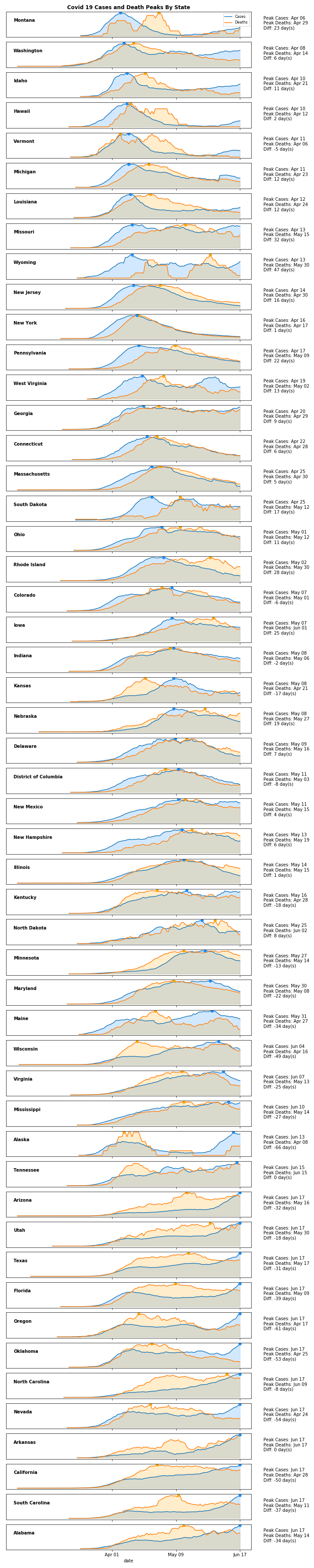
Although one would expect peak deaths to follow peak cases, this is not always the case.
Peak deaths in Nevada, for example, occurred on April 24th, but peak cases have been in the last week. This same peculiar pattern can be seen in a variety of states, from California to Oklahoma.
Mapped: The Evolution of COVID-19 in the U.S.
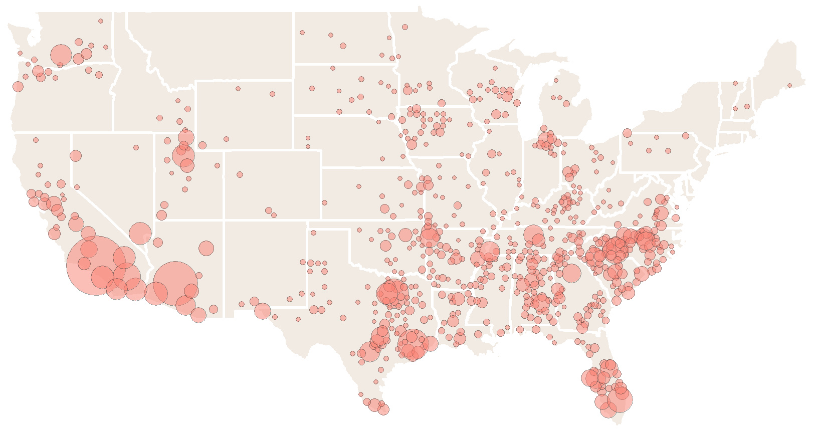
As the pandemic spreads and the situation has evolved, the mean center of weekly COVID-19 cases has been moving in a southwest direction.
The following map, which also comes from Reddit user bgregory98, averages the center coordinates of all counties weighted by how many new confirmed cases they have had over the past week:
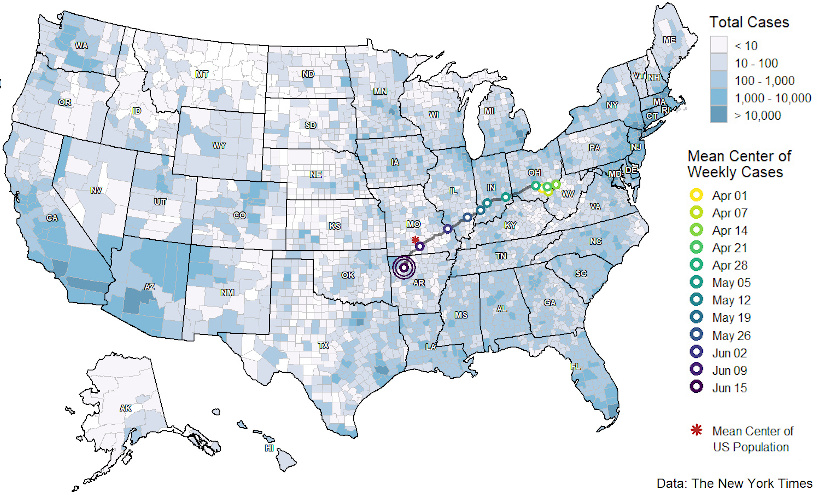
Originating in Ohio, the mean center of cases was initially heavily skewed by cases in the New York metro area. Since then, the mean center of cases has shifted and has now journeyed slightly past the mean center of U.S. population, located in Missouri.
This is partially a regression to the mean, but it is also driven by growing case counts in aforementioned states in the southern and western parts of the country.
Mapped: Peak County Totals
Finally, the progression of COVID-19 within the U.S. can be mapped in another useful way, revealing a geographical perspective to the virus’ spread.
These maps from Winston Saunders show places where current disease levels are below their previous peaks (blue), and where current COVID-19 cases are at highs (red) as of June 18:
Cases Below Previous Peaks
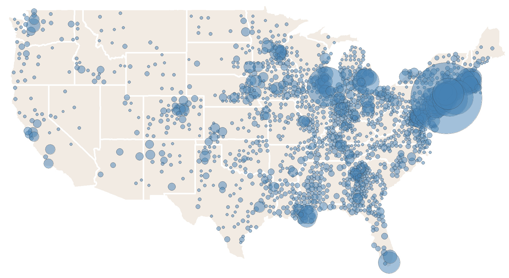
Cases at Peak Levels
This again shows the shift from the Northeast and Midwest parts of the country towards the West and South regions.
As always, the path of the virus’ spread will continue to change and evolve, and the picture could again look quite different in just a few weeks time.


Healthcare
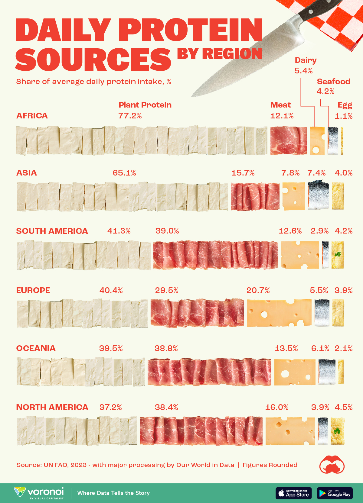
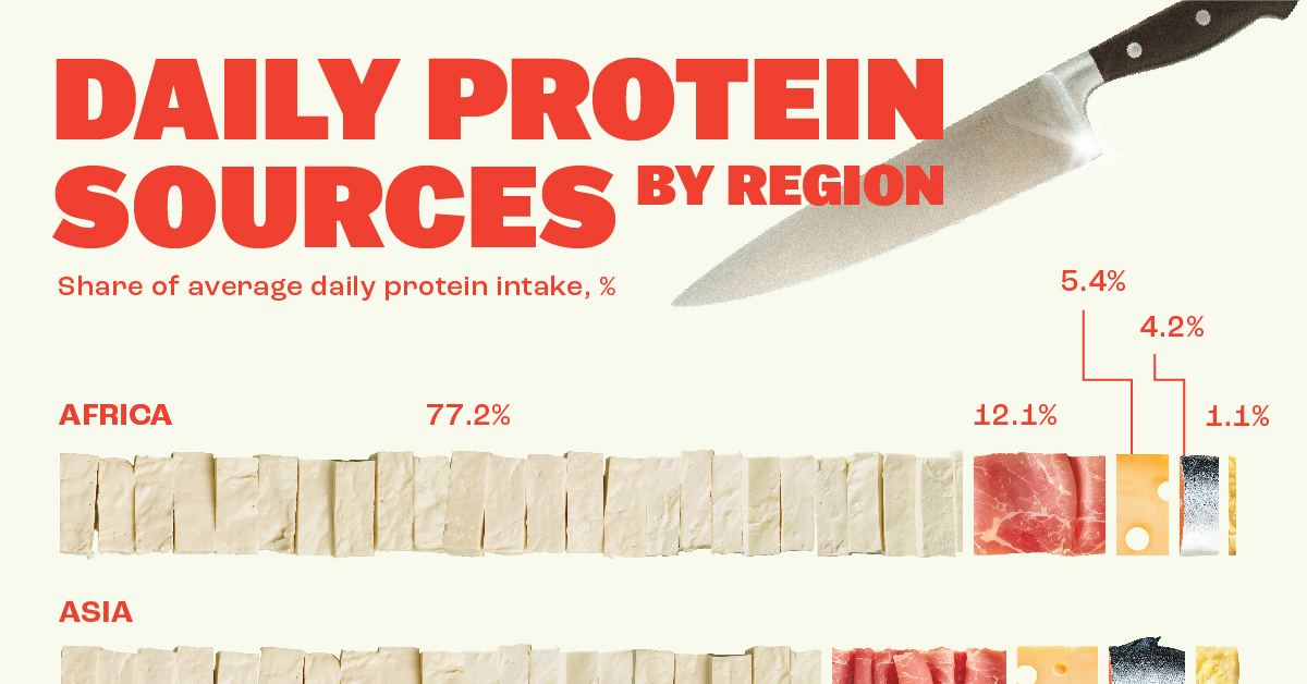
Visualizing Daily Protein Sources by Region
Here, we break down how people around the world get their protein intake.
Visualizing Daily Protein Sources by Region
This was originally posted on our Voronoi app. Download the app for free on iOS or Android and discover incredible data-driven charts from a variety of trusted sources.
Protein plays a vital role in creating and maintaining every cell in our bodies.
This graphic breaks down how people in different regions of the world get their protein intake. The figures come from the UN Food and Agriculture Organization (UN FAO), accessed via Our World in Data.
The figures we present here reflect the distribution of daily protein intake across regions, with each region’s total adding up to 100%. It’s important to note that this is distinct from the actual amount of protein consumed per person, often measured in grams.
Developed Countries Have More Access to Meat and Dairy
Protein has many benefits for our bodies. It is a building block of bones, muscles, cartilage, and skin. Our hair and nails are comprised mostly of protein. It is also used to repair tissue, oxygenate the body, and make enzymes, which aid in digesting food.
People in more developed regions (like North America or Europe) get a larger share of their daily protein from meat and dairy.
| Region | Plant protein (%) | Meat (%) | Dairy (%) | Seafood (%) | Eggs (%) |
|---|---|---|---|---|---|
| Africa | 77.2 | 12.1 | 5.4 | 4.2 | 1.1 |
| Asia | 65.1 | 15.7 | 7.8 | 7.4 | 4.0 |
| South America | 41.3 | 39.0 | 12.6 | 2.9 | 4.2 |
| Europe | 40.4 | 29.5 | 20.7 | 5.5 | 3.9 |
| Oceania | 39.5 | 38.8 | 13.5 | 6.1 | 2.1 |
| North America | 37.2 | 38.4 | 16.0 | 3.9 | 4.5 |
When only considering meat, South America, with big producers like Brazil and Argentina, takes the lead as the most important protein source.
Meanwhile, Asia, with top fish producers China and India, leads in protein intake from seafood.
In Africa, where many developing countries in the world are located, plant protein is the most important protein source for the population.

-

 Stocks7 days ago
Visualizing Berkshire Hathaway’s Stock Portfolio (Q1 2024)
-

 United States3 weeks ago
Comparing New and Current U.S. Tariffs on Chinese Imports
-
 Politics3 weeks ago
Which Countries Have the Most Economic Influence in Southeast Asia?
-
 United States2 weeks ago
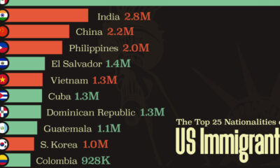
The Top 25 Nationalities of U.S. Immigrants
-

 Countries2 weeks ago
Ranked: Countries Where Youth are the Most Unhappy, Relative to Older Generations
-

 Technology2 weeks ago
Visualizing the 5 Most Common Cybersecurity Mistakes
-
 Maps2 weeks ago
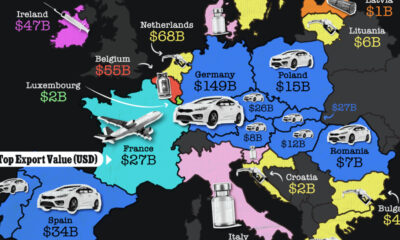
Mapped: The Top Export in Each EU Country
-

 Maps2 weeks ago
Mapped: Indian States with Cities Over 1 Million People